Brand Reveal: Fatty Arbuckles Hair Artistry & Lather Lounge

Annette, the owner of Fatty Arbuckles Hair Artistry & Lather Lounge (FA), reached out to me looking for an update on her current branding. Fatty Arbuckles has been in business 18+ years and has been nominated as one of Perth’s top ten salons for the past two years, quickly positioning itself as a leader in the Australian hairdressing industry.
Annette’s lease was due to expire and as she prepared to move into a new location, she felt it was the perfect time to give her current branding a facelift. However, having been in business for 18 years she wanted to make sure we kept some aspects of her current branding. The main logo has been a crown for quite some time, so we decided to keep the crown as the main logo, but redesigning it to feel much more modern. Annette also felt that she had totally outgrown the fonts used in the logo so we took the current font which was more fun and playful, and updated it to have a classic and more established feel to coincide with FA’s well known and established status in the Australian hair industry. We coupled these updates with a more refined and polished color palette, as well as a moodboard to provide inspiration and direction for the overall feel of Fatty Arbuckle’s new brand.
Here’s a look at the before and after:

Before & After

Crown logo before
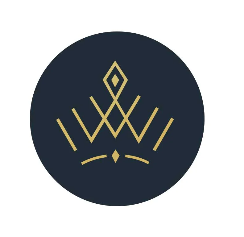
Crown logo After
What do you think? I'd love to hear your thoughts in the comments below. If you want to take a look at the full rebrand you can check it out on my portfolio.